Attracting visitors to your website
Up until a few years ago, attracting new visitors organically was done by having search engines like Google index your web pages and hoping they send traffic to your website. To improve the results, search engine optimization (SEO) techniques were often used. This has not changed, but the concept is now extended by also having a blog that adds to the amount of traffic search engines send to you.
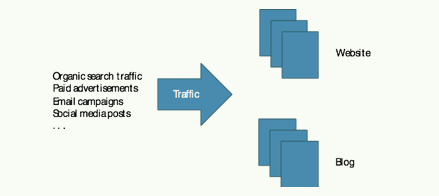
The website, and increasingly the blog, are your prime mechanisms for attracting new visitors. In addition to getting organic traffic, the website or the blog are usually the destination of various marketing campaigns, such as paid adverts, social media channels, or offline marketing. They should therefore be the centerpiece of any online marketing strategy.
The Website
Your website should, of course, look fabulous, with a consistent coloring and typeface scheme, beautiful layout and graphics, and modern and intuitive navigation controls, slideshows, and other widgets. Furthermore, the website needs to be responsive and auto-adapt its layout when visitors browse the Internet using mobile devices with a small screen. It should also contain a lot of engaging and useful information on your products and services.
In fact, the more web pages with lots of text information, the better. This is because search engines like Google can only drive traffic to your website if your pages contain the information Internet visitors are searching for. A website with mostly stunning photos (perhaps with text painted into the bitmap image) are entirely ineffective from a search engine optimization point of view. Don’t forget: search engines can only look in text. Include relevant text on your website if you want search engines to send visitors your way. Lots of it.
Without a website, you can’t make use of the other online marketing tools either. Make sure your website looks great and contains all the information needed for both your visitors and search engines to be happy.

The Blog
Apart from the regular company website, the blog is the other major tool you can use to attract visitors. Some years ago, blogging was mostly confined to teenagers writing about their personal life, but things have changed and having a blog is now a critical asset in the Internet marketing strategy of any company.
The key to this is that the website outlining your product offering will typically have a finite set of web pages, and they have to be written in corporate marketing language to make the website look professional. As such, it may be difficult to add a large number of additional web pages in a way that feels natural to website visitors. In particular, it becomes difficult to add pages with slightly more informal content and language that may be needed to engage with your audience on a personal level.
Since being found by search engines is crucial to getting more potential customers to see you, having more pages published increases your chances of search engines sending traffic your way. A blog is a perfect vehicle for this.
There is absolutely nothing wrong with your existing leads and customers visiting your blog frequently; in fact, it is great and can have many positive effects, including leads nurturing, thought leadership, and brand building. But one of the primary purposes of the blog is to fill it with many (perhaps hundreds of) blog articles over time. Use the blog to add as many pages as possible on the Internet, thus increasing the chances Google searches result in traffic to your site.
The great thing with blog articles is they stay “forever” on the Internet. It requires some effort to write a blog article, but once it is published, it will remain on the Internet for years, continuing to attract traffic from search engines like Google with no additional effort or expense on your part. The marketing value does not stop when the advertising budget is exhausted.
Blog hosting
A blog is often hosted on a different server from your regular website (but it doesn’t have to be). If so, hyperlinks on your website promoting the blog may open it in a different browser window. There are many independent blog hosting solutions available on the Internet, and you can integrate it into your standard website if you prefer.
If your blog is not hosted on your company website, I recommend using a subdomain like blog.mycompany.com if your site is on www.mycompany.com. This means your blog uses your domain name (mycompany.com), which ensures that any blog traffic helps improve the search engine authority of your regular website and vice versa. I write more on website authority in a later chapter, but for now consider it a score of how important search engines think your website is.
In particular, you want to ensure that your blog does not use the domain name of the blog platform supplier, such as mycompany.somebloghosting.com, as your traffic will help improve their search engine authority instead of yours.
Blog article title and content
The blog should cover topics from your industry or pain points of your readers, and not promote or sell your products or company other than as a side effect. I try to follow these rules when writing blog articles:
– A catchy title containing the search keywords I want to get traffic from
– Minimum 750-1000 words of text
– The text must contain the targeted search keywords a couple of times, but not so often to make the writing feel forced or awkward. A few times is enough.
– Minimum one photo or graphic to spice up the article
– A personal, warm, and friendly writing style
– Genuinely helpful, informative, and educational content, without strong product promotion. Alternatively, share your thoughts on something that relates to your industry
The first point is important. A great title is everything, both for search engines and human readers. It is commonly said that you should spend half the time writing the blog article, and the other half coming up with a great title. Make sure the title contains the search keywords you want to optimize the blog post for and make it attractive for human readers too. For some reasons, numbered lists seem to generate more clicks, as do words in square brackets.
Examples of this are:
– 77 best ways to grow your instagram followers
– Become a gardener in 15 steps
– Learn more about slow cooking [eBook]
– Interview with Tim Cook [of Apple fame]
Since a blogger is supposed to write many blog articles frequently, it is easy to run out of ideas for new blog posts. In fact, the problem is large enough for people to create blog topic or title generators that auto-generate ideas for blog articles. Search for “blog title generator” to find a few of them.
For search engines to find your article using the search phrase “get more facebook page likes”, these keywords need to be present in the title, as well as a couple of times in the article copy. However, be sure not to add the keywords too many times (known as keyword stuffing) as this may cause search engines to reduce your ranking as a penalty. More on this in the section on search engine optimization.
In fact, you should probably write several different blog articles targeting the same search keywords to have more articles fishing for traffic from that specific search phrase. Having a number of articles targeting the same keywords increases the likelihood at least one will catch some of the traffic. Just make sure to modify the title and copy (body text) enough to make it look like a different post, even if they cover almost the same topic (but perhaps from a different angle). Post them a few weeks apart so as not to bore your frequent readers, who will otherwise notice the repetition.
I have also found it useful to write blog articles that ask questions that don’t need to be answered in the blog article, like “Is Porsche better than Ferrari?” In the article, just outline some pros and cons, and let the reader judge. There’s no need for you to provide an answer to the question, it is simply an excuse to publish an additional blog article for Google and other search engines to find.
Another idea is to ask industry influencers if you can email some interview questions to them, and publish their answers in a blog article. If you are selling outdoor sports equipment, a nice blog article could be, for example, “What the mayor of [YOUR CITY] thinks about the new mountain trails.”
Have you recently created some new digital assets or other offers that can be promoted? Be sure to write blog articles like:
– Learn more on Molecular Gastronomy [new training video]
– Read our new eBook on digital photography
– Visit us at the [EVENT NAME] Expo in New York next week
Your blog articles should provide links back to your website (backlinks), or to other blog articles containing relevant information. This provides more visibility for your other pages and offers, and lets the reader engage more deeply with you for a longer time.
Remember the buyer personas we talked about earlier? Make sure each of your blog posts is targeted at a particular buyer persona, such as “Joe the development manager” or “Carol the software developer”. They have different interests, problems, and pain points, and may like different writing styles as well. Ensure that when you write each blog article, you adapt it for a particular buyer persona to make it a perfect fit for that person.
Write blog posts with different targets, if you need to. The more, the better.

Blog frequency
How often do you need to write new blog posts? I’d say at least once a week, more often if you can. However, when you start the blog, you will need to fill it with ten or so articles immediately, before too many visitors start coming. Otherwise they may deem it useless and not come back.
The more blog posts you have, the greater the chance potential readers will find an article using search engines. In all cases, make sure the articles are genuinely helpful to the visitors, providing high-quality reading, without too much apparent product promotion.
Chapter summary
This chapter outlined how to attract visitors using a website and a blog, including details on how to set up the blog and write effective blog articles. While many Internet marketing strategies involve things outside of the website, it is still the centerpiece of it all, with the blog as the second most important part.The next chapter looks at how to convert anonymous visitors into identified leads.
The leads conversion process
Having many anonymous website visitors is great, but you must convert them into leads if you want to do any active marketing to them. There is a well-defined process for turning anonymous website visitors into identified leads. This is where the rubber hits the road—you need to get this right to get performance out of your online marketing.
So you have a new anonymous visitor to the website. How do you get his or her contact information? By asking for it, of course! The problem is, contact information is not easily shared these days. You have to offer something of value in return.
This is where digital assets, call-to-action buttons, landing pages, registration forms, and thank you pages all come into play. If this sounds like Swahili to you, don’t worry. It isn’t all that complicated, and they all interact to set up a working leads generation system.
– Digital assets are something valuable visitors want to get
– Call-to-action (CTA) buttons promote the offer and drive traffic to landing pages
– Landing pages with registration forms collect leads information
– Thank you pages or delivery emails deliver the digital assets
The beauty of it is that once you have it setup, it will run automatically, generating leads while you are abroad on holiday or mountain trekking on weekends. The system will relentlessly work for you day and night, generating more leads all the time. The only problem is, there is work for you to set this up in the first place.
To start with, you must have a digital asset or something else of desire to offer. A digital asset must have an educational or otherwise meaningful value. It can be a PDF document of some sort, a video tutorial, free evaluation versions of your software product, or your weekly stock market advice email.
When you have a desirable digital asset to offer (or something else, like free product samples), you can advertise it on your web pages, in blog articles, and in emails. The advertisement is done using a call-to-action (CTA) button. A CTA is just a clickable button or banner advertisement that promotes the offer to entice the visitor to click on it to get access to the offer.
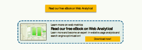
Every web page on your website, every article on your blog, and every email you send should have at least one call-to-action button offering something. In short, take every opportunity you can to trigger your visitors to register their contact information.
For example, if a blog article is on French wines, you could include a call-to-action button offering a digital asset that relates to that topic. This could be an infographic map on the wine regions of France, or your eBook on the history of French winemaking. However, in your blog articles on cheese, you need a different digital asset that brings value to readers interested in that topic. Perhaps your weekly cheese tasting report will interest them, or your cheese making recipe eBook.
It is important your offers provide genuine value to your visitors, and that they relate to the topic of the web page or blog post that promotes them. If you search for “TikTok strategies” and find a blog article on the subject, it is not likely a call-to-action button offering an eBook on cooking triggers a click, right?
A click on a call-to-action button should open the landing page. The landing page has one purpose only: to make the visitor fill in their contact information in a registration form and click on a “Submit” button. To that end, the landing page should have no distracting options (like a navigation menu) that can make the visitor do something else and abandon the process.
Once the visitor has filled in the contact information and submitted the registration form, they are automatically redirected to a thank you page confirming the transaction. Now that you have the contact details, the game is reversed. The thank you page should be designed to keep the visitor on the website longer. Therefore, it should contain navigation controls, links to related reading on your website, and additional call-to-action buttons offering more educational content.
Through all this, do not fail to keep your part of the business deal. The visitor gave you the contact information, and now you must give him or her the digital asset. This can be done by sending an automatic delivery email with a download link, or by publishing the download link right on the thank you page.
Now, let’s go into more detail and learn how to design effective call-to-action buttons, landing pages, registration forms, and thank you pages. They should all be optimized to collect as many leads as possible. The following sections outline best practices for this, and the next chapter covers how to create various types of digital marketing assets and how to optimize them for the best marketing results.
Call-to-action (CTA) buttons
Call-to-action buttons are fundamental to converting as many anonymous visitors as possible into leads. The CTA promotes your offer and is the first step of the leads conversion process. Call-to-action buttons can promote anything, and can be placed in any of your digital content including web pages, blog articles, emails, PDF files, and thank you pages.
Almost every web page, blog post, email, or PDF document you create should contain at least one call-to-action button that entices the reader to visit a landing page and register. Take every possible opportunity to add call-to-action buttons that promote your digital assets or other offers. A web page, blog post, email, or PDF document without a call-to-action button is a lost opportunity. Without the contact information, you cannot do any proactive marketing to your visitors.
The difference between a good call-to-action button and a poor one is what click-through rate it achieves. A well-designed call-to-action button can trigger many visitors to click on it, while an ineffective one doesn’t. If visitors don’t click on the CTA, they will never see the landing page with the registration form. To collect as many leads as possible, you need to have a great call-to-action button with a high click-through rate.
It is easy to add a call-to-action button somewhere as an after-thought at the end, but the better approach is to reverse the process. Before your write a new blog post or mailshot, consider what the next step is in the reader’s customer journey. Then you can optimize the copy of the blog article or email so it leads up to the CTA button. This makes the reader want more information on the subject and increases the likelihood he or she will engage further.
Usually, the destination page of a call-to-action button is a dedicated landing page, with access to the digital asset guarded by a registration form. Make sure clicking on the CTA button opens the landing page in a new web browser window, rather than moving the visitor from the original page to the landing page in the same browser window. Why?
First, if the visitor doesn’t like the landing page or its offer, he or she will close the browser window to get rid of it. Unless the call-to-action button opens the landing page in a new window, you have also lost the visitor from your website if this happens. By letting call-to-action buttons open landing pages in new browser windows, you keep them on your website should they close the landing page window. At least you get a second chance to keep their interest.
Second, landing pages should be focused on the one and only goal of getting the visitor to submit the registration form. Hence, landing pages should have no navigation menus or other distracting content. This is hard to achieve if the landing page lives in the regular website window, as the website template likely adds menus and other distracting elements to all pages.
The title and other text on the call-to-action button should be short, with a clear message, and written in an actionable language. In practice, this means the title should start with a verb, like “Download…”, “Request”, “Read…”, “Watch…”, or “Learn…” It should also explain what the offer is and include relevant keywords. Try to be as clear and concise as possible.
The call-to-action button must stand out graphically, and should be relatively large without dominating the design. You want it in contrast (signal) colors, but you also want the coloring to work well with the visual scheme of your website.
A call-to-action button is a clickable hyperlink and must, therefore, look like a clickable object. Often this means it graphically looks like a button, but it can also look more like a banner advertisement. A call-to-action button that looks like a well-designed banner-ad will likely get a higher click-through rate than one that just looks like a text button.
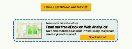
A text button can be implemented using HTML with CSS styling, or using a bitmap image. A graphical banner ad usually combines text and graphics inside the bitmap, as well as a region within the banner ad that looks like a clickable button. This is technically not the case, since the full image is the clickable area, not just the part of it that looks like a button. You can make it look more like a clickable object by adding rounded corners, 3D borders, and shading.
A recent trick to increase click-through rates is to add an arrow pointing to the call-to-action button. The arrow is annotated with a label along the lines of “Click here” or “Get the eBook”. This can help draw more clicks.

To create images implementing your call-to-action buttons, you can either use a bitmap editor like Adobe Photoshop (commercial) or GIMP (free). Perhaps easier, just use Microsoft PowerPoint or Apple Keynote and save the graphics as a bitmap image. There are also many button builder services on the Internet you can find with a search for “button generator”.
Now that we know how to design call-to-action buttons, where should they be located for highest click-through rate?
First, a call-to-action button should only be placed on a web page or in an email with content relevant to the offer it promotes. A call-to-action button advertising a motor yacht buyer’s guide may not perform well on a web page on windsurfing, for example. Create another digital asset relevant to the web page and promote that instead of adding out-of-place offers.
Second, the call-to-action should be visible above the fold (i.e. without any need to scroll down to see it). Additional call-to-action buttons can be added below the fold, but make sure at least one of them is visible without scrolling. The exception is blog articles, where it makes the most sense to have the call-to-action button at the end of the article. The thinking here is that the blog article text leads up to the CTA offer.
The top left part of a web browser window is the area Internet users see first, so you may want to put your call-to-action button in that region. But this is not always possible, as the call-to-action button must also be located close to the content discussing the topic related to the offer. Make sure there is some white space around the CTA to make it look like an independent object, but don’t put it too far away from the text that relates to it either, as it may become visually disconnected.
Landing pages
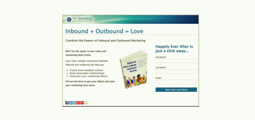
Along with call-to-action buttons that promote the offer, landing pages and the registration forms on them are the remaining parts that make or break the collection of contact information. This is a good example, although I would have used a contrast color for the Submit button:
Each landing page is dedicated to just one task: to offer a particular digital asset and deliver it in return for contact information. Make sure there are no distractions that can make the visitor catch interest in anything else.
There should be no navigational controls whatsoever on a landing page, and this is why they often open in a new browser window outside of the regular website. This means the landing page has no menus and no other types of clickable links. There should be only one thing to do on the landing page: to fill in the registration form and click on that clearly visible submit button.
Make sure all content on the landing page is above the fold. Your visitors should not have to scroll down to see all of it. Remember, you want to reduce all distractions that may cause the visitor to lose interest and leave the landing page without registering their contact information.
All landing pages follow the same concept. They contain a company logo, a header, an image or photo, the body text, and a registration form with a highly visible submit button. Perhaps they include social sharing buttons too (this is the only distraction that is allowed).
The page header should clearly explain what is offered in an easy to comprehend manner. You don’t have many seconds to keep the interest of the visitor. The language should be actionable, such as “Download our eBook on Windsurfing”. If you need to say more in the header, add a sub-header like “A beginners guide to windsurfing”.
Place a relevant graphic under the title, and make sure it relates to the offer. Is it an eBook or some other document? Add an image of the book. Since it is unlikely you have the physical book available in print to take a photo, create a virtual image of it. There are many services on the Internet offering 3D book cover image generation. Search for “free 3D book cover generator” to find some options, or take a screenshot of the first page of the document and use that to create a thumbnail image.
Below the header and image, provide the text outlining the content of the digital asset offered and the benefits of registering to download it. The copy should only be a couple of paragraphs of text describing what the offer is or contains, and a couple of paragraphs outlining how the offer will benefit the visitor (the value). Use bullet points highlighting the main value proposition and use boldface to highlight important keywords. Help the visitor to make a decision to register quickly; do not write too much text that can delay the “I will submit” decision.
At the bottom of the landing page, you can add social sharing buttons, with the hope visitors will spread the word of your offer (Facebook Shares, for example). This is the only exception to the rule of not having any distracting elements on the landing page. It is worth the tradeoff if your landing page is shared on social media, as this can attract more visitors.
With the header and body text written in a compelling way to attract interest, and a beautiful image to further entice visitors, you need to add a registration form to collect contact details.

Registration forms
Registration forms are where the leads information is collected, and usually live in landing pages. Sometimes, registration forms live embedded in normal web pages or in blog articles too, but this is usually for simple forms, such as asking for an email address only. Registration forms can also exist in other shapes, for example pop-up or fly-out windows requesting visitors to fill in their email address when they arrive to the page. These are a bit more aggressive and intrusive.
Most often, the form stores the captured data in a leads database for further use later. This is the best way of recording the data unless you don’t have a large number of leads. If this is the case, a simpler solution might be to have the form send you an email with the submitted information. Content management systems like WordPress or Joomla have numerous plug-ins that support these options, and marketing automation systems provide even better solutions.
How many question fields should a form have? You clearly want to know a lot more than basic contact information. If you run a sports equipment web shop, you will benefit from knowing what type of sport interests this lead. If you are in the software business, you may want to know if the visitor uses a Windows PC or Apple computer. A yoga club may want to know what type of classes the person is interested in. Companies selling complex and expensive software solutions may want to know the timeframe to start the deployment, and the work title of the lead.
Every business has its own set of questions to help segment the leads into different profiles or buyer personas. You can provide more relevant marketing content to the lead if you know more about them and their interests. The visitor, on the other hand, would prefer to give you no information at all. In reality, this boils down to having an acceptable balance between your desire for more information and the visitor’s wish to give out as little as possible.
In general, you should only ask a minimum number of questions (one to three fields) if the digital asset is of relatively small value, such as a one-page infographic or registering for your monthly newsletter email. If the offer is of high value, such as free software, a training webinar, or a consultation, you can ask ten questions or so. For medium-value offers, such as eBooks, video tutorials, or white papers, perhaps five to seven fields are acceptable.
Remember, the more fields you have in the registration form, a larger share of visitors will abandon the process and exit the landing page without registering. You need to find the right balance. Form fields that are usually mandatory are the email address and often the first and last name. After that, the list of questions is highly dependent on your business.
You can use the number of form field questions to your benefit. Do you want more leads, even if they are of low quality? Use a smaller number of form field questions to reduce the bar. If you are already drenched in low-quality leads, you can add more form fields to scare off those with the least interest. People with a genuine and strong interest usually accept answering more questions than people with a marginal interest.
A final note on the form’s Submit button. This should be the only clickable object on the landing page (except social media sharing buttons), since you want everything optimized for the one and only goal of getting the visitor to click on it. The Submit button should stand out visually by using a contrast color. Ideally, the default button text “Submit” is not the most effective. Instead, use a button text that explains what will happen in actionable language. Examples include “Download Now” or “Download the eBook”.
How is a registration form created and added to a landing page? How does it store the captured contact information in a database? And how do I get the delivery email to be sent automatically once the Submit button is clicked?
These are all excellent questions and unfortunately, not so easy to answer. It depends on your website technology platform. If you use a content management system like WordPress or Joomla, there are plug-ins that can add this type of functionality. If your website runs on a basic web server without the ecosystem of a content management system, you are out of luck and you will have to build this logic yourself using HTML/JavaScript/SQL. Alternatively, try to find a dedicated landing page builder and hosting solution that enables you to create the landing pages with registration forms easily using their site. Many email service suppliers offer this feature, for example Campaign Monitor, GetResponse, MailChimp or AWeber.
The best way by far is to have a fully integrated marketing automation system like HubSpot, SalesForce Pardot, or Marketo. Marketing automation systems offers a fully integrated approach to almost everything related to online marketing, including call-to-action buttons, landing pages, registration forms, leads databases, emailing, and much more. The capabilities of modern marketing automation systems will be covered later.

Thank you pages
Thank you pages end the leads conversion process. Once the visitor has submitted the landing page registration form, two things needs to happen:
– You must deliver the digital asset offered on the landing page
– You must give the visitor a visual update indicating the “transaction” was successful
This is handled by thank you pages. After the Submit button has been clicked on a landing page registration form, the visitor should automatically be redirected to a thank you page. This gives the lead a visual update confirming the form submission went well. It also provides an opportunity to thank them for their interest in your offering and to make it available for immediate download.
However, the thank you page is also a perfect opportunity to direct the new lead to further information by adding more call-to-action buttons promoting additional content, with the hope of engaging a bit longer. So what does a good thank you page look like?
First, you can return the navigation controls. You now have the contact information and can relax a little bit. You also want the new lead to continue browsing for more information on your website. Adding menus and other navigation controls will help. You must also deliver the offer promoted by the landing page.
There are two options:
– Have the digital asset available for immediate download on the thank you page
– Send an automatic email delivering the digital asset
The first option is the most natural, is easiest to set up for you, and is most convenient for your leads. The problem is that this setup allows visitors to get access to your digital asset by entering fake or non-existent email addresses.
The other option is to send an automatic email with the download link. This is more cumbersome to setup and is more inconvenient to the lead, as there may be a delay before the email arrives, or it may be stopped by spam filters. However, at least you know you will get a working email address.
It is up to you which one to choose, but I tend to prefer the second one as it gives me working email addresses, even though it is more complicated to setup. This solution does not help against temporary email addresses, of course, so it is not bulletproof either.
If you are on social media like Facebook, LinkedIn, or Twitter, add social sharing buttons to the thank you page to make it easy for the new lead to share the offer on the recently downloaded digital asset to his or her friends.
Chapter summary
This chapter focused on how to convert anonymous visitors into identified leads, using call-to-action buttons for promotion of desirable digital assets, landing pages with registration forms for leads capture, and thank you pages and delivery emails for content distribution.The next chapter details what digital assets you can create to entice visitors to give you their contact information, along with best practices in how to create them.
End of “Mastering Digital Marketing, Part 3”.